HSU & Associates

Their Greatest Weakness
Website
What should the brand design of a law firm look like?
We understand that our design is "very different from a traditional law firm," but this isn't about going against the grain for the sake of it. While rebellion is inherent to designers, everything needs a reason, and a brand requires core values.
For the general public, the profession of a lawyer is highly specialized and often associated with costs. It's about law and comes with a sense of detachment, so we don't intend to make it appear "very friendly".
After all, it's not a place you casually stroll into like a shop.
However, we also don't want it to be cold and distant; people seek warmth.
The strategy in brand planning is to let the visuals speak for themselves. In the logo, you'll notice intersecting straight lines, but the outer contour is circular, presenting an emotional exterior with a rational core.
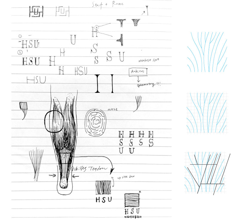
The logo's design concept is "A lawyer's most powerful weapon: identifying the opposing party’s weaknesses." We drew inspiration from the well-known Greek tale of Achilles for this concept.
***
The Greek figure Achilles was an invincible warrior, yet his most vulnerable spot was his heel, later known as the Achilles tendon area. Taking this tendon as a prototype, we simplified and decomposed it to create the visual emblem for this law firm.

.jpg)
.jpg)
.jpg)
.jpg)
.jpg)
.jpg)


Published on 2023/12/5
Catalogue / en

