AIPS
website
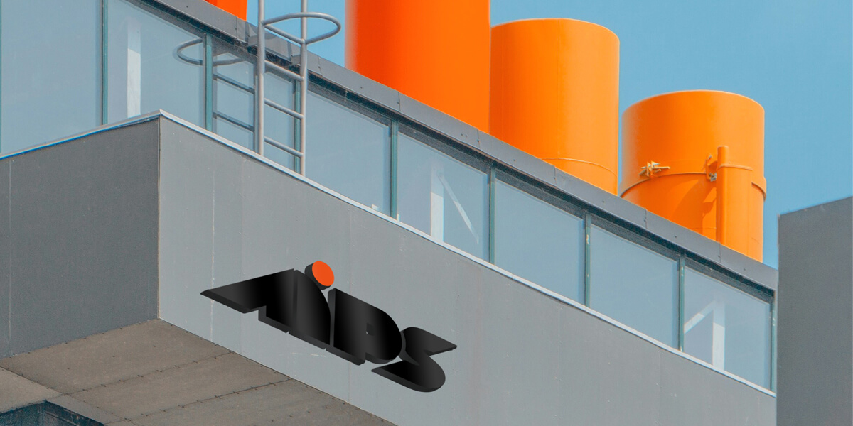
AIPS
Advanced Intelligent Perpetuity Solutions

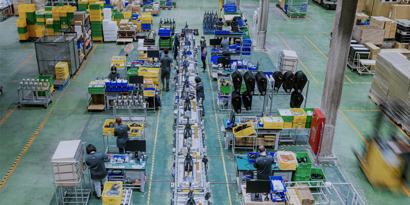
The AIPS project we're handling is for one of Giant Group's subsidiaries. Giant is an internationally renowned enterprise specializing in designing and manufacturing bicycles. AIPS, on the other hand, focuses on developing intelligent products in the realm of sports. Presently, it serves as an OEM for numerous well-known spinning bike brands. Hence, apart from catering to end consumers, it collaborates with other brands as well.
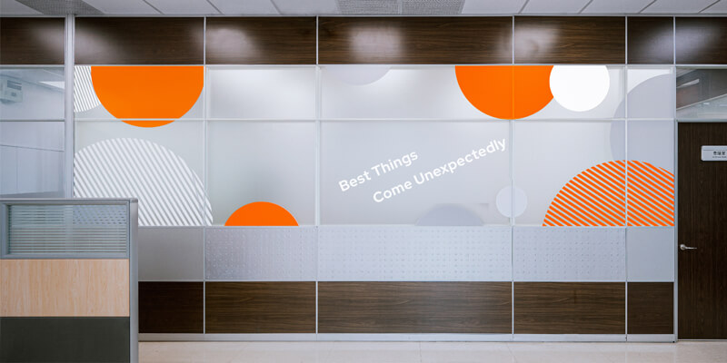
To convey the attributes of intelligent sports and resonate with the parent company, we've symbolized forward momentum and adventure through the body's inclination when riding a bicycle. The suppleness and elasticity of the human body represent moves with the times. To symbolize 'speed,' we've visualized it as circular elements navigating through time and space, capturing the essence of AIPS consistently leading the way."
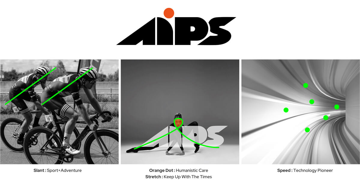
Logotype Design Concept
- Overall solidity with a lower center of gravity: Trustworthiness and sincerity
- Inclined letters (A and S) : Progress and adventure
- Rounded corners on the letter 'i,' accentuated by an orange dot: Human-centric care


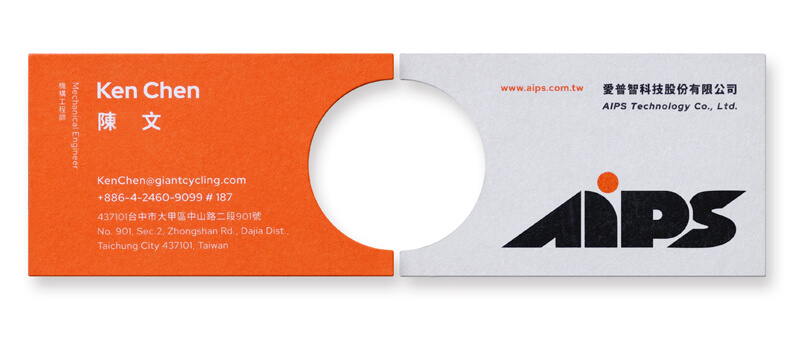
Business card exchanges typically occur during interactions with partnering companies. Therefore, we've designed the business card with a semi-circle cutout. When two cards are aligned, a complete circle is formed, emphasizing the significance of collaboration.
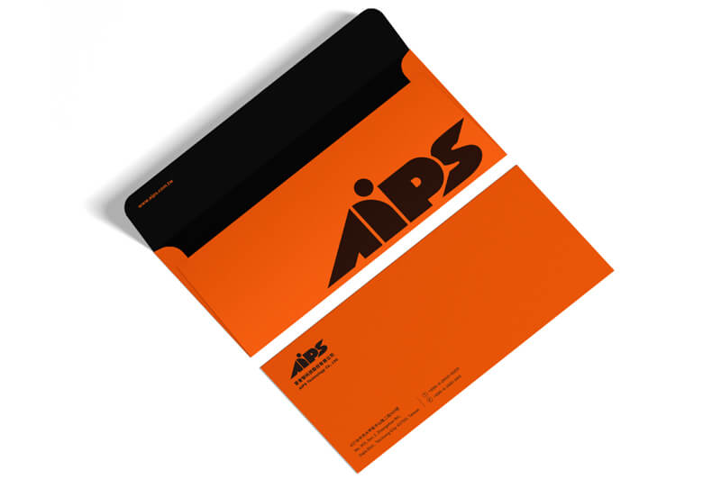
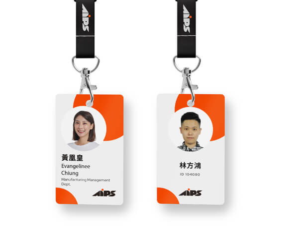
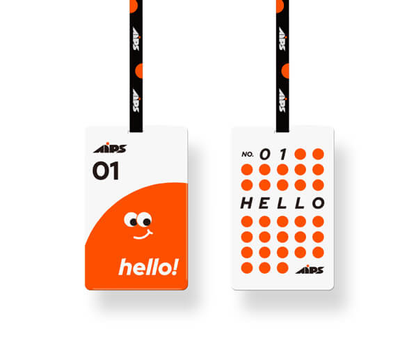
Employee identification cards incorporate orange dots to evoke the vibrancy associated with the sports industry. Visitor passes replace 'Guest' with 'HELLO,' aiming to reflect the company's liveliness and creativity.




.jpg)
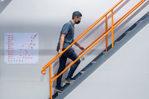
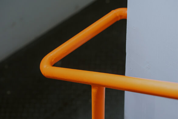
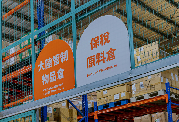
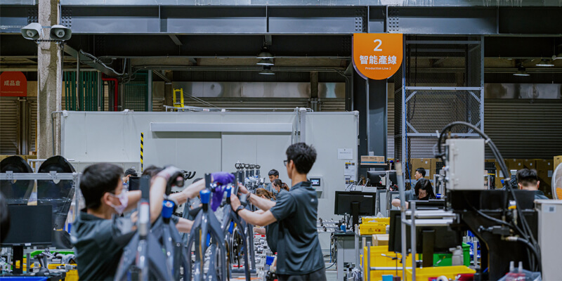
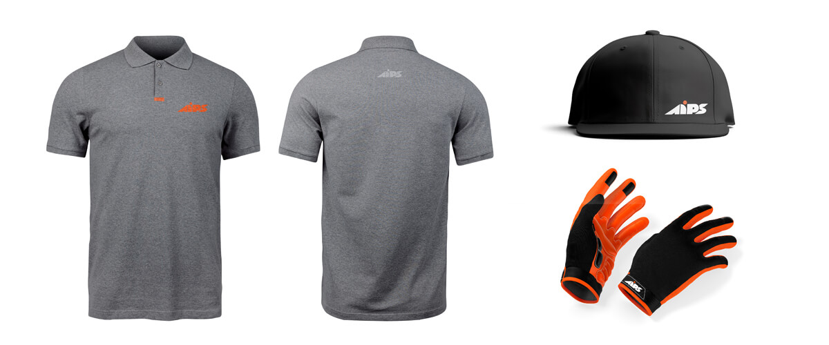
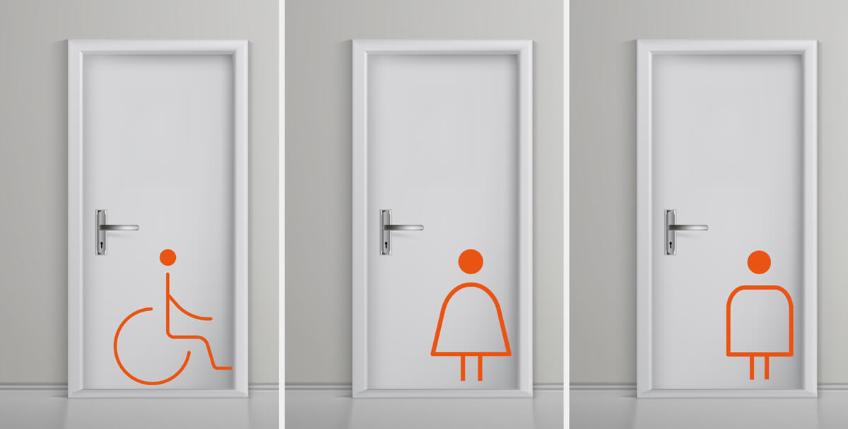
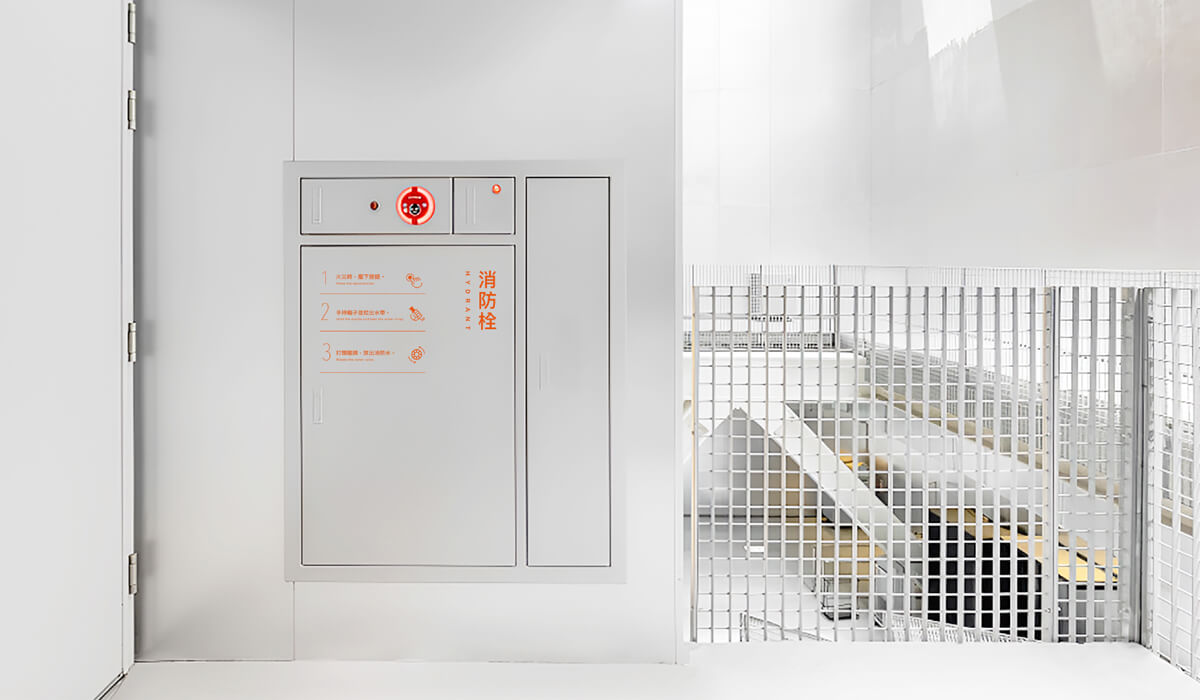
In this project, we're also responsible for designing a sign system. Our objective is to create instantly recognizable icons while infusing orange elements into specific areas, allowing the Corporate Identity System (CIS) to seamlessly permeate through.

.jpg)
.jpg)
.jpg)
Published on 2023/11/30
Catalogue / en

